Return to River City

One of my first posts was about Elle Rush's teasers for her River City Heroes series. I was very pleased with her new teasers. However, it turned out that there was someone who wasn't so pleased: Elle Rush.
Ruh roh.
A couple of months after I did the teasers for her, Elle very politely asked me if it would be possible to put new font on images that she had chosen. Since this was both a paying job and an excuse to make more teasers, I happily agreed. Elle provided both the photos, the text, and the icons she wanted.
The first teaser went smoothly. I used her copy, gave her two options, and she selected one. Here's what it looks like:

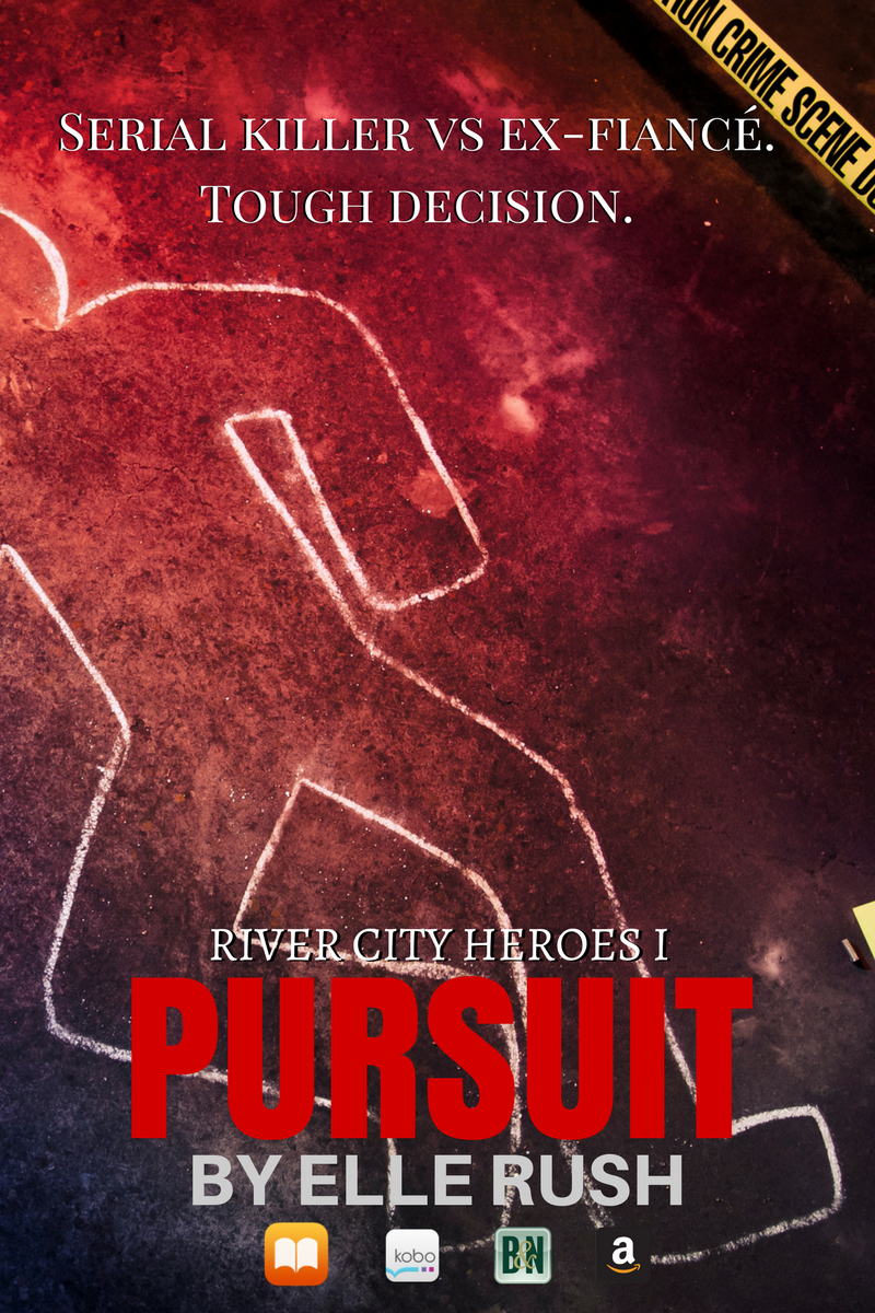
But the second one was a lot more difficult. All her other images feature police tape, and police tape is bright and attention-grabbing. That's so you don't trample a corpse or something. But bright yellow bands of text compete with the copy. Frankly, it was a hot mess and not something I could fix while doing everything she wanted. This teaser has too many elements. There is no single focus that your eye is drawn towards, and your eye darts all over the place instead of reading smoothly.

Ugh. The conflict between art and commerce. I know this well from my days working at an ad agency.
Client:"It needs to communicate all our product features."
Art Director: "Sob. But I want it to look cool."
Lawyer: "You're going to have to say 'cheese-like product' instead of 'cheese.'" (This really happened. I thought the writer was going to slit his wrists with a ballpoint pen.)
But I digress. Meeting challenges produces better work. I believe in this creative philosophy. I went back to Elle's email where she mentioned that her visual inspiration was movie posters. I Googled "suspense movie posters" to get a sense of what they looked. Lo and behold, they all look pretty much the same. Dark photos, red chunky titles. And their layouts were always the same.
Bing! That's the sound of me getting an idea. What if I flipped the layout?
One constant source of puzzlement to me is the sheer number of different sizes you need for each kind of social media. And it changes more frequently than you might think. So, to simplify, I use this Buffer page on social media. If you scroll down, they have a paragraph for those who have given up:
Our two favourite image size templates that cover most networks
In experimenting with the fastest, easiest way to create images we know will work well in social media feeds, we came across a couple of image sizes that became our go-tos: one size for horizontal (landscape) images and one for vertical (portrait) images.
Horizontal (landscape) - 1,024 x 512
Vertical (portratit) - 800 x 1,200
Boom! I switched up to a vertical layout and before you could say, "DNA evidence," I had some pretty dramatic looking teasers. Case solved.


One sad note: this size does not work well in Twitter, which prefers a 2:1 horizontal format. It still shows the middle, but you need to click on it to see the whole thing. :(
Elle really loves the new teasers! I can tell because she's using them a lot! Yay.
Ideas to steal:
It's always tough to communicate images in your mind, so use actual visuals to show your designer what you want.
Check out the latest social media sizes, as they change regularly.
Any questions or requests for future posts, please leave them in the comments. Next Monday, why an author brand board is a good idea. Also, I explain what the heck an author brand board is.

Comments
Post a Comment