Mel goes back!
I am always looking for opportunities to make graphics and hone my skills. So when Olivia Dade organized a Twitter event for authors called #NotRWA17, I volunteered to make a graphic for her and offered a prize of two teasers.
The winner of the prize was Karyn Gerrard, a writer of historical romances. I was excited to work on a genre completely out of my wheelhouse.
What is the ideal teaser size? Unfortunately, social media has a variety of sizes, but the recommended size for use on both Twitter and Facebook is 1024px by 512px. Karyn said she would use the teasers in both these places.
For Karyn's Blind Cupid series, I searched for a more complex font that might be used on historical novels. If you already own the font that's on your covers I would suggest using PicMonkey instead of Canva, because you can use your own fonts there. Or you could pay for the higher level of Canva unless you're cheap like me. I played around with a few designs, but it was very difficult to find period photographs of couples—especially when I can't tell Victor from Victorian. I settled on the idea of each of her covers being framed and hung on a wallpapered wall. This would feature the covers and give a sense of history. I experimented with ornate and plain gold frames, but the plain frames showed off the covers better. Karyn supplied the quotes for each book. Although the prize was originally for two teasers, once I had the template set up it was easy to pop the other covers in and make her a complete series.


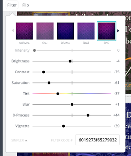
Okay, here's my Canva tip of the day. The wallpaper is a Deposit photo and the original colour was maroon. I changed the same photo to get coloured wallpapers to match each cover. If you go to the background layer, hit the Filter button, and then choose Advanced Options. Under that, go to Tint, and play with that bar, moving it towards the colour you want. You'll have to wait for the change to appear. As you can see here, I also played with other bars too. Experiment and try this for yourself. The Undo button is your friend here.
One observation: if you look at my teasers for Jaymee Jacobs, Elle Rush, and Karyn Gerrard, you may see some design similarities. This is because a long rectangular format like this gives you few options for placing the cover—right side or left side. Never in the middle because that would cut the way the eye moves over the teaser.
Once I took a graphic design class at Vancouver Community College, and one assignment was to take all the elements of a Ford truck ad (headline, copy, visual) and put them in order. Mine was almost exactly like the original, and a classmate accused me of having seen the original. But I hadn't. I only knew that ads are put together with the headline on top, then the graphic, then the copy. The viewer expects to see things this way and you should follow convention when it comes to layout. Be creative with the visual or your copy, but using unconventional layouts can end up looking like crap.
Tips for you:
1. Take your colour palette from the covers. The orange details on The Governess and the Beast all came from the orange font on the cover, and each teaser is the same. Doing this creates harmony between the cover and the teaser.
2. Feature your website on teasers. Usually, you're posting with a link, but this reminds readers where they can find more information.
3. Darkening the background pops your covers out.
As always, I welcome your comments and questions. Are you now inspired to check out Karyn's books?
The winner of the prize was Karyn Gerrard, a writer of historical romances. I was excited to work on a genre completely out of my wheelhouse.
What is the ideal teaser size? Unfortunately, social media has a variety of sizes, but the recommended size for use on both Twitter and Facebook is 1024px by 512px. Karyn said she would use the teasers in both these places.
For Karyn's Blind Cupid series, I searched for a more complex font that might be used on historical novels. If you already own the font that's on your covers I would suggest using PicMonkey instead of Canva, because you can use your own fonts there. Or you could pay for the higher level of Canva unless you're cheap like me. I played around with a few designs, but it was very difficult to find period photographs of couples—especially when I can't tell Victor from Victorian. I settled on the idea of each of her covers being framed and hung on a wallpapered wall. This would feature the covers and give a sense of history. I experimented with ornate and plain gold frames, but the plain frames showed off the covers better. Karyn supplied the quotes for each book. Although the prize was originally for two teasers, once I had the template set up it was easy to pop the other covers in and make her a complete series.


Okay, here's my Canva tip of the day. The wallpaper is a Deposit photo and the original colour was maroon. I changed the same photo to get coloured wallpapers to match each cover. If you go to the background layer, hit the Filter button, and then choose Advanced Options. Under that, go to Tint, and play with that bar, moving it towards the colour you want. You'll have to wait for the change to appear. As you can see here, I also played with other bars too. Experiment and try this for yourself. The Undo button is your friend here.

One observation: if you look at my teasers for Jaymee Jacobs, Elle Rush, and Karyn Gerrard, you may see some design similarities. This is because a long rectangular format like this gives you few options for placing the cover—right side or left side. Never in the middle because that would cut the way the eye moves over the teaser.
Once I took a graphic design class at Vancouver Community College, and one assignment was to take all the elements of a Ford truck ad (headline, copy, visual) and put them in order. Mine was almost exactly like the original, and a classmate accused me of having seen the original. But I hadn't. I only knew that ads are put together with the headline on top, then the graphic, then the copy. The viewer expects to see things this way and you should follow convention when it comes to layout. Be creative with the visual or your copy, but using unconventional layouts can end up looking like crap.
Tips for you:
1. Take your colour palette from the covers. The orange details on The Governess and the Beast all came from the orange font on the cover, and each teaser is the same. Doing this creates harmony between the cover and the teaser.
2. Feature your website on teasers. Usually, you're posting with a link, but this reminds readers where they can find more information.
3. Darkening the background pops your covers out.
As always, I welcome your comments and questions. Are you now inspired to check out Karyn's books?

Comments
Post a Comment